
M4S
In the summer of 2023, I led the rebrand of Math4Science (M4S), giving it a fresh, modern look while retaining essential elements of its original identity. This project also included a comprehensive website redesign to align with the new visual identity and enhance usability, making it more accessible and easier to navigate.
BRANDING ▪ WEB DESIGN

Problem
The original M4S branding and website design were outdated and cluttered, leading to poor user engagement and difficulty in navigation. These issues hindered M4S's mission to provide valuable educational resources and support.
Solution
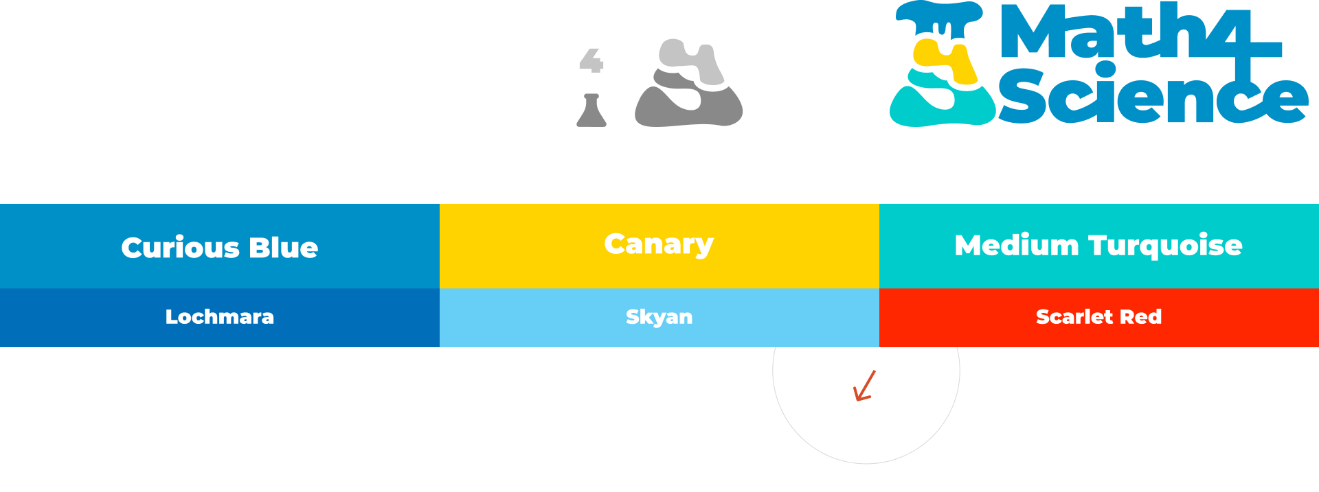
The rebrand aimed to modernize M4S's overall visual identity to reach its target audience and ensure reflecting its core mission by retaining key elements. As part of the rebrand, I revamped the M4S website with a modern, clean design, improving navigation and content categorization. This overhaul resulted in a more intuitive, user-friendly experience, effectively engaging the target audience and better supporting M4S's mission.
-
Math4Science (M4S) felt they were in a hiatus for way too long, they wanted to relaunch. But M4S felt their original brand was very outdated and irrelevant, they wanted to resurface with a fresh look and feel that is designed to resonate strongly with their main target audience – students. They envisioned a new look to feel inviting, bold, modern, exciting, and 'groovy.'
The
Rebrand
Brand
Applications
-
To bring the new visual identity of M4S to life, the rebrand extended beyond the logo to include a comprehensive application across various touchpoints. Below are the different applications of the rebrand, demonstrating how the new visual language has been seamlessly integrated across all platforms.


-
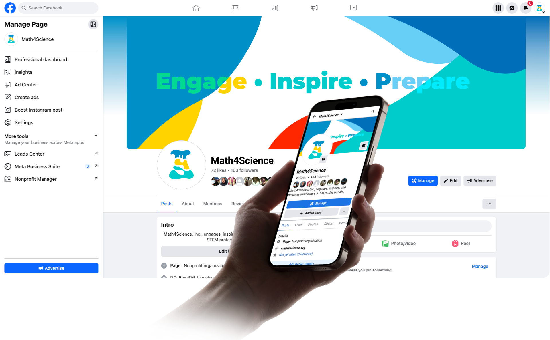
As part of this rebrand, I was tasked with revamping the existing website to align with the new visual identity, making it more accessible and easier to navigate. Leveraging my expertise in UX/UI design, I focused on both visual aesthetics and user experience, making it easier for end-users to access valuable information and tools.
PROBLEM:
The original design was cluttered and confusing, making it difficult for users to find information. The outdated design also failed to engage the target audience, leading to low interaction.
SOLUTION:
I utilized a modern, clean WordPress template design, customizing it to create a more intuitive, user-friendly experience. Enhanced navigation and clear content categorization now allow users to quickly find relevant information.
Website
Overhaul

You can explore the transformation by comparing an archive version of the M4S website with the current redesign.